
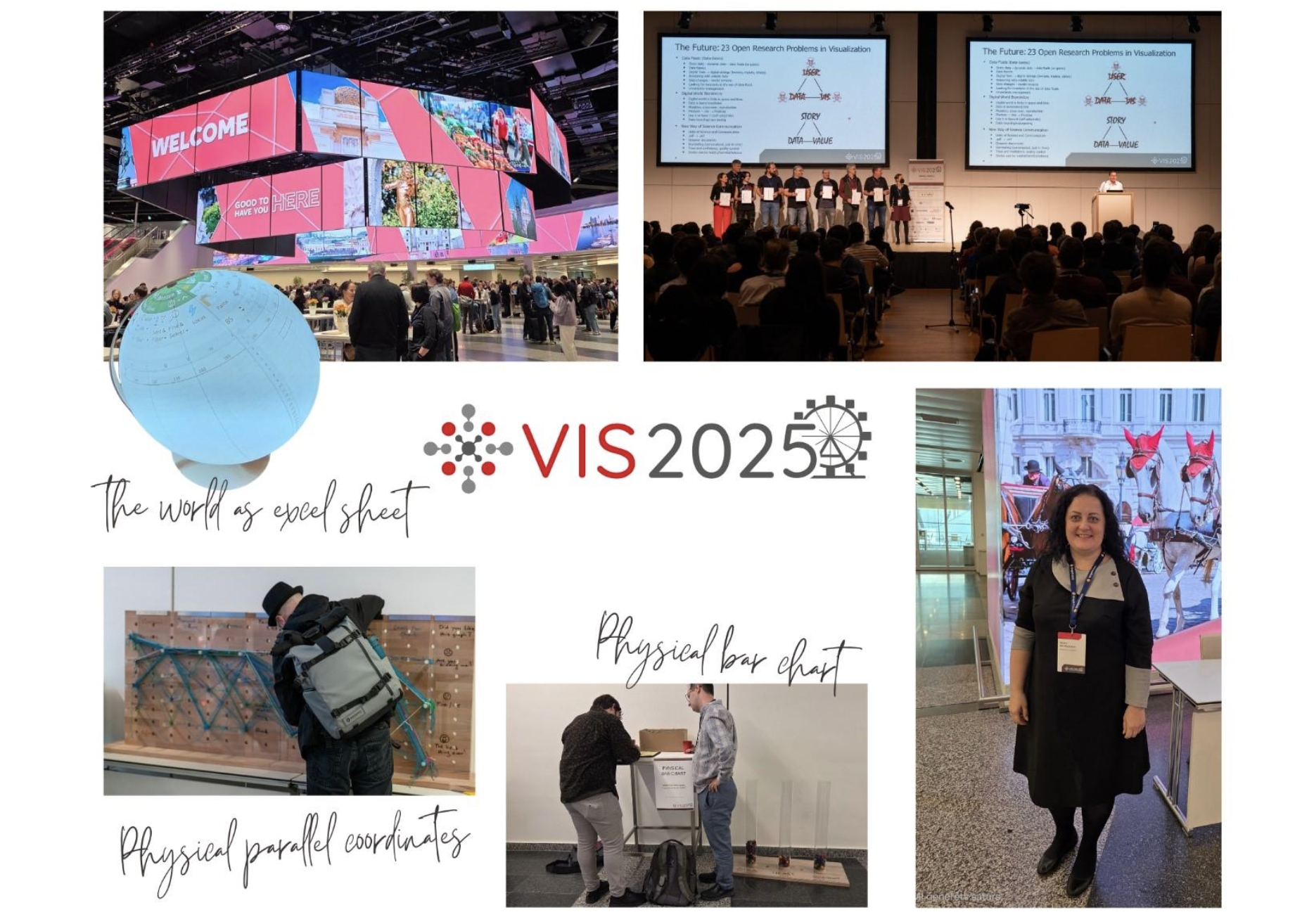
The IEEE VIS 2025 conference was held in Vienna, Austria from November 2 to November 7, 2025. This international research conference discussed the theory and practice of data visualisation – from algorithm development to user experience issues and communication effectiveness. The conference was attended by Iveta Andersone, a representative of the Latvian Data Curators Network, as the only participant from the Baltic States.
The main takeaway from the conference is simple and significant – visualisation is not a neutral representation of data, but rather its representation in a visual form so that people understand what the data means and why it is important. In addition, visualisation always contains additional information – trust in the data source, the identity of the institution or author, indications of which data the author saw as important and chose to emphasise. Visualisation is communication, and it influences how people interpret data and make decisions.
Research presented at the conference shows that people evaluate visualisations not only by how clear and understandable they are, but also by their design – color choices, font type, and overall impression. Visualisations with complex font types and formal style are perceived as less trustworthy, while clear and simple visualisations create the impression of professional competence. This means that design choices (colors, fonts, layout) affect not only how people understand the numbers, but also how they experience and evaluate visualisation.
The conference also highlighted the fact that the understanding of visualisations is not universal. Some people find colors different, some find it difficult to read text, and some are confused by interactive elements. When creating visualisations, it is necessary to think about the significant differences between different audiences – perception of color and contrast, text size adaptability, which often means more than the graphic design itself. Ensuring accessibility means not only adding text alternatives, but also a structurally different approach to displaying data – sometimes a simple table or list of numbers is a clearer solution than a complex graph.
It is also important that visualisation is always created from a specific perspective. The author’s choices – which data to emphasise, what scale to use, what story he wants to tell – affect how the data is interpreted and what conclusions the audience draws from it.
The IEEE VIS 2025 conference demonstrated that visualisation is only effective if the creator understands who their audience is and what is important for them to know. This is an important lesson for anyone who works with data.
